

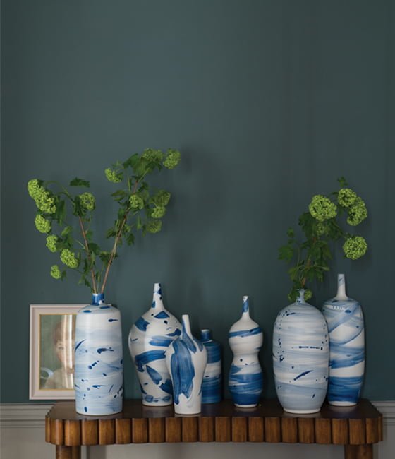
 They only bring out new colours every three years so the launch this week of the new Farrow & Ball paint colours 2016 was a bit of an event. Their nine new colours have, they say, been “carefully chosen to refresh the Colour Card with pale neutrals, muted pastels and some vibrant brights to accent”. Great timing, too, as this is the year we need to do a little bit of refreshing of our own in some of our rooms at home.
On Monday I watched a livestream presentation on the Farrow & Ball website by Joa Studhome, their head colour consultant, and it was fascinating to hear her talk about the new paint colours, why they’d been chosen to fill gaps in the existing range, and how they can be used with other colours to create exciting colour palettes. Let’s take a look:
New Farrow & Ball paint colours 2016
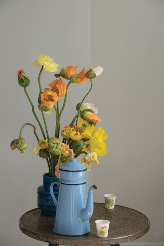 First the light neutrals. Named after the dust sheets used by decorators to protect floors and furniture, Drop Cloth is a darker version of the new Shadow White, and the classic Shaded White. This trio of colours work effortlessly together as tone on tone neutrals and one use, suggested by Joa, would be to paint kitchen units in Drop Cloth against walls in Shadow White. Fresh yet muted, the darker units and lighter walls would make a space look larger.
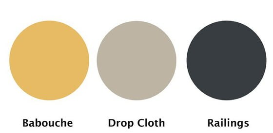 For a punchier, contemporary graphic look, Farrrow & Ball’s head of creative Charlotte Cosby suggests teaming Drop Cloth with colours such as Babouche and Railings.
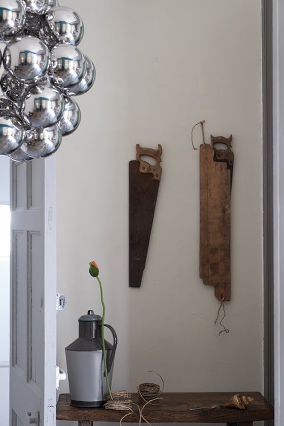 Shadow White, above, takes its name from the soft tone created when bright whites are used in shaded areas and is “the perfect colour for devotees of lighter neutrals who want to steer clear of grey- and yellow-based whites”.
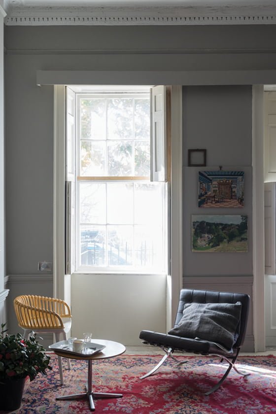 Worsted, above, was developed as an accent colour for the family of greys that include the lighter Purbeck Stone and the stronger Mole’s Breath. It gets its name from the Norfolk village where the flat woven fabric known as worsted was originally produced.
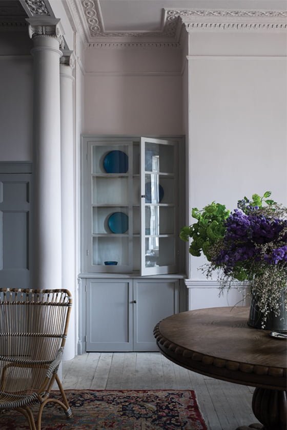 Here’s one of my two favourites of the new Farrow & Ball paint colours – Peignoir. It’s a very soft pink that has had a serious dose of black added to it, making it a mysterious tone that will read as grey to some, pink to others. And obviously that will very much depend on the light conditions too. But it’s a strong contender for our new bedroom colour – as F&B say, it’s a pink that’s not just for girls.
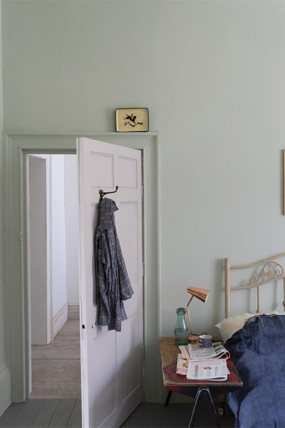 The very soft, muted Cromarty was inspired by sea mist and named after the Cromarty Firth estuary, which gets a mention in the daily Shipping Forecast. It’s a lighter version of Mizzle and would work well with Light Blue, Blue Gray or Pigeon.
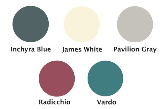
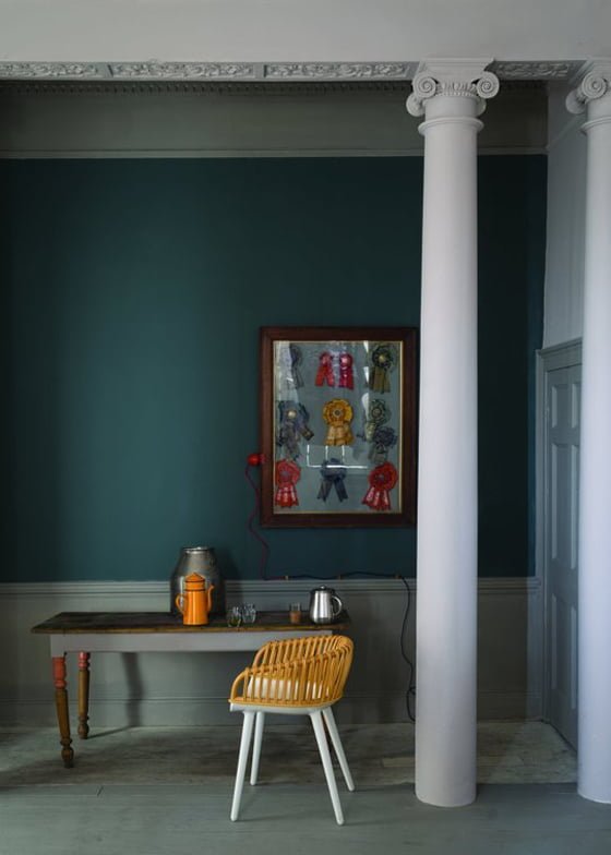 On to stronger colours now. It it a blue? Is it a grey? Is it a green?.. No, it’s Inchyra Blue which, depending on the light, could appear as any of those hues but Farrow & Ball describe as an aged blue grey. It was initially developed to paint the doors of the outbuildings of the historic Scottish Georgian mansion, Inchyra House, and has now been introduced into the colour card for wider use.
If you’re over the grey trend that’s had us all in its grip for the last few years, Farrow & Ball say of Inchyra Blue: “It is the perfect alternative to charcoal for use on walls in contemporary homes. This perfectly captures the ongoing popularity of dark tones on all four walls”.
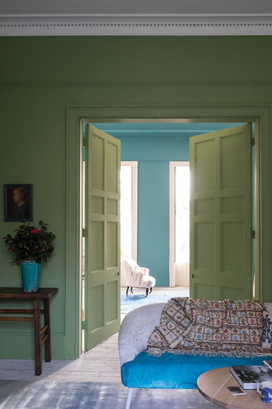 The next of the new Farrow & Ball paints colours for 2016 is definitely a green – Yeabridge Green to be precise – and was found on the wall in an 18th century Somerset farmhouse when an original cupboard was removed.
It fits into the existing range by having a little more yellow than Breakfast Room Green, but a little less than Churlish Green (another great name!).
Joa observes that it’s “perfect for garden rooms to create a harmonious connection with the exterior. As a result of its strength of colour, it won’t particularly change in different light, but will look freshest in bright summer midday light”.
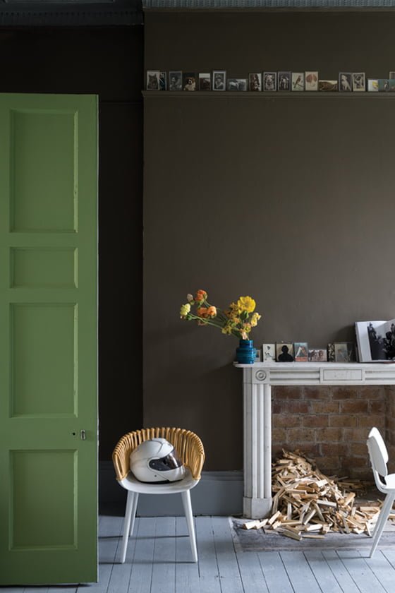 Next up, Salon Drab, that was created in response to numerous requests for a true, contemporary chocolate brown, although it’s also a very classic 19th century colour too. It works best with the yellow- and red-based neutrals and they advise against using it with blues and greys.
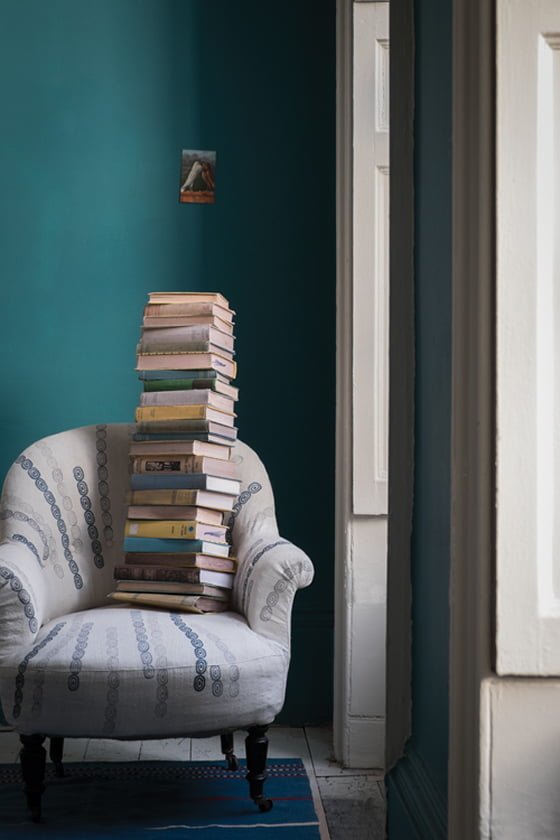 I’ve left my other favourite until last – of course, it had to be some kind of teal/turquoise – the glorious Vardo. It’s named after the traditional horse-drawn gypsy or Romany wagons that were often painted a very similar colour, and it’s definitely a hue to lift the spirits and make you smile.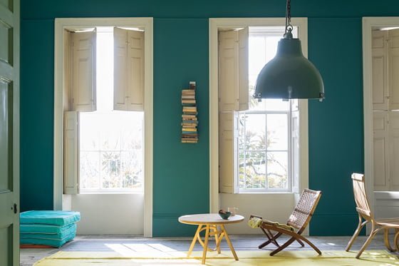
Indeed, Joa sums it ups nicely: “Vardo walls can’t help but make you smile, especially when combined with colours of equal strength such as Radicchio which could be used on furniture. It looks fresh with James White woodwork, elegant with Pavilion Gray and super sexy with Downpipe”.
So, that’s it from Farrow & Ball for another three years. Have any of their new paint colours caught your fancy? I’d love to hear about your projects, and will report back in due course as to which of them, if any, we use.
Images: Farrow & Ball
Be the first to receive more posts like this
Sign up below to receive our regular updates plus news, events
and offers direct to your inbox.
We never share your information – you can unsubscribe at any time.
[wysija_form id=”4″]


Comments are closed.